For a long time, Dynasort could tell you what your numbers were. It couldn’t tell you their story.
“Conversion rate is 2.3% over the last 30 days” is a fact. But it’s a fact with no context. Is 2.3% good for this collection? Is it up or down? Did it move because of the recipe you swapped two weeks ago, or the pins you added last Tuesday, or nothing you did at all? The old Insights left you to answer those questions yourself, usually by exporting data and guessing.
We rebuilt Insights so it answers them for you. This is the largest performance-visibility update we’ve shipped, and it spans six connected features.
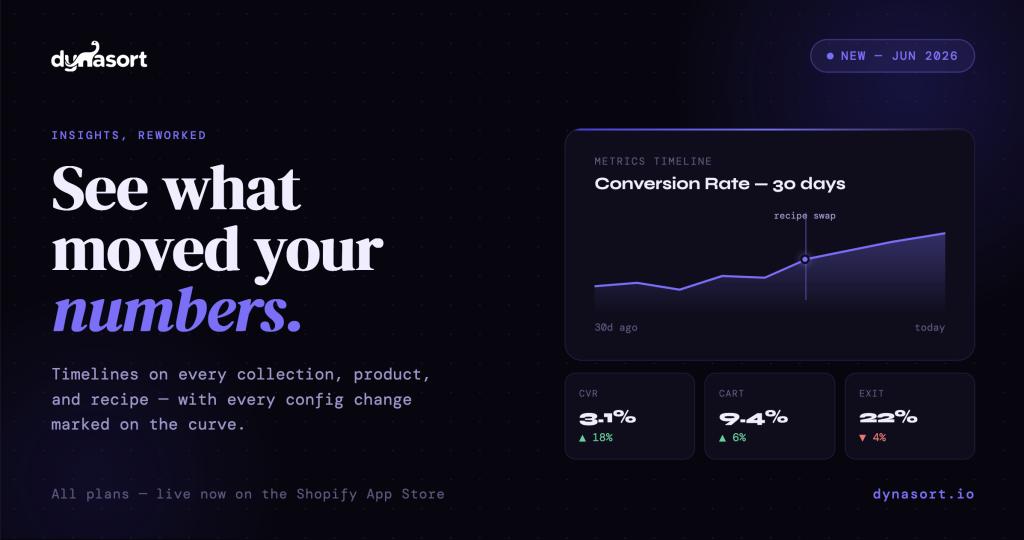
Metrics Timeline, on everything
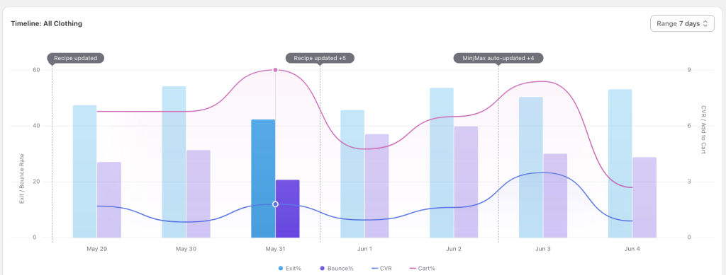
The centerpiece is the Metrics Timeline, now at the bottom of every collection, product, and recipe page. It charts your key rates — conversion, add-to-cart, exit, and bounce — over time.
What makes it more than just a chart is what’s plotted alongside the curve: change markers. Every time you swapped a recipe, added a pin, adjusted attribute weights, started or stopped an A/B test, or made any of a dozen other meaningful configuration changes, a marker appears on the timeline at that exact moment.
This is the difference between seeing a number and understanding it. If your conversion rate climbed over the last two weeks, you can now see whether that climb started the day you swapped recipes — or whether it was already happening and your change had nothing to do with it. Cause and effect, on the same chart.
A dashboard, not a settings panel
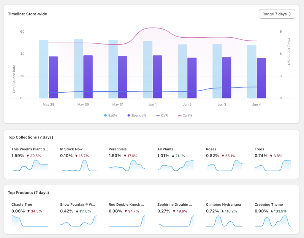
Open Dynasort now and the first thing you see is a store-wide performance timeline for the last seven days. Below it sit three Top Movers panels: your top collections, top products, and top recipes.
We chose “movers” deliberately. It’s not just a list of your best performers frozen in place — it surfaces what’s changing, in both directions. Each tile shows a thumbnail trend chart, the current conversion rate, and a colored arrow indicating the percentage change versus the prior week. Green arrows mark wins worth repeating. Red arrows flag problems worth fixing. Click any tile to drill into that entity’s full timeline.
The point is that you no longer have to hunt for what’s working or what’s slipping. The app puts it in front of you the moment you open it.
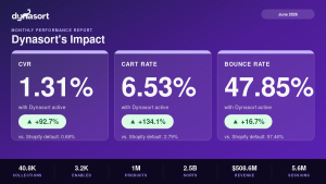
Stop guessing whether you’re improving
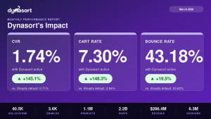
The Insights page now opens with a six-KPI strip: sessions, conversions, conversion rate, cart rate, exit rate, and bounce rate. Each shows the value for your selected window plus a colored arrow showing how it compares to the equivalent prior window.
Pick “30 days” and you immediately see how the last 30 days stack up against the 30 before them. The arrows handle the directional intuition for you — conversion rate up is green, exit rate up is red. “Are we trending up?” used to mean exporting data to a spreadsheet and building a comparison by hand. Now it’s the first thing you see.
A change log you don’t have to maintain
Below every timeline chart is a chronological list of every meaningful configuration change: what changed, when, and by how much. Attribute weight bumps, A/B test starts and stops, manual sorts, pin updates, recipe swaps — all named with the friendly attribute and recipe names you actually use, not internal IDs.
For teams sharing Dynasort access, this is a shared audit trail. You can see what a colleague changed and tie it directly to the movement in the metrics above it. For solo merchants, it’s a changelog you get for free instead of trying to remember what you did and when.
Recipe performance that’s actually trustworthy
Recipe pages get the same timeline treatment, with one subtle but important detail handled correctly: time-accurate attribution.
If you moved a collection from Recipe A to Recipe B last Tuesday, Recipe A’s history correctly shows the traffic from before Tuesday, and Recipe B shows the traffic after. The data reflects what was actually true at each point in time, rather than taking today’s recipe assignments and projecting them backward across the whole history. That means when you compare two recipes, you’re comparing real performance, not an artifact of who happens to be assigned where right now.
Click a row, land on the chart
Finally, a small quality-of-life addition: clicking any collection, product, or recipe row in the Insights table takes you straight to that entity’s page, already scrolled to its timeline. No scrolling past settings to find the data you came for.
Built to be reliable from day one
A few things happening beneath the surface, for merchants who care about the plumbing:
Enterprise stores were backfilled with 90 days of historical timeline data, so your charts are populated immediately rather than starting empty. The underlying analytics pipeline was rebuilt to keep high-volume stores current — previously, very large stores could silently fall days behind; now the pipeline catches up adaptively. And the entire system is timezone-correct, so international merchants see complete data through their own “yesterday,” not the server’s.
Available now
The reworked Insights is live today on all plans. Open the app and you’ll land on the new dashboard. From there, every collection, product, and recipe has its timeline waiting at the bottom of the page.
Questions or feedback: hello@dynasort.io or in-app chat.