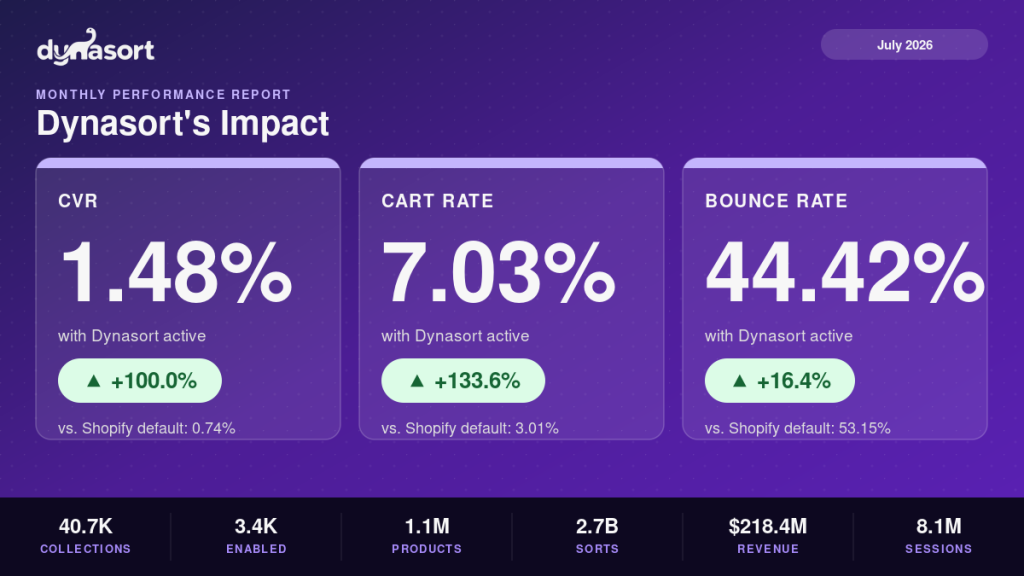
Sorted collections converted at twice the rate of default sorting
Fleet-wide shopping behavior, collections on Dynasort versus collections on Shopify’s default order
Before = collections on Shopify’s default sort order. After = collections actively sorted by Dynasort. July 1 to July 31, 2026, all stores, aggregated and anonymized.
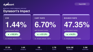
Every month we publish the same four numbers: how collection pages actively sorted by Dynasort performed against collection pages left on Shopify’s default order, across every store on the platform. July’s numbers are above, drawn from 8.1 million collection page sessions. Sorted collections won on every metric we track, and the conversion gap was exactly two to one.
How to read these numbers honestly
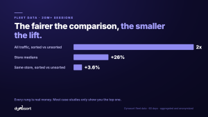
These are observational fleet numbers, not a controlled experiment, and we want you to read them that way. Merchants tend to switch on automated sorting for the collections that already matter most, and the stores that bother sorting are usually the stores that bother optimizing everything else too. Some of that two-to-one gap is the sorting. Some of it is selection. Anyone who tells you a fleet-wide comparison is pure product effect is selling you something.
The clean way to know what sorting does for your store is the A/B test built into Dynasort: run automated sorting against your default order on the same collection and let your own traffic decide. Our monthly numbers tell you the direction and the size of the opportunity. Your test tells you the truth.
What each metric is saying
Conversion rate, 1.48% versus 0.74%. The percentage of collection page visitors who completed a purchase. On 10,000 collection visits a month, that spread is the difference between 74 orders and 148 orders from traffic you already paid for.
Cart rate, 7.03% versus 3.01%. How often visitors add to cart from a collection page. This was July’s biggest relative gap, and it is the upstream action that feeds everything else. When the right products surface earlier in the scroll, more shoppers take the first commitment step.
Exit rate, 58.81% versus 64.51%. How often a collection page is the last page a visitor sees. Lower is better. Fewer exits means more browsing, more chances to convert, and stronger engagement signals.
Bounce rate, 44.42% versus 53.15%. Single-page sessions that land and leave. If you drive paid traffic straight to collection pages, this is the number to stare at: on sorted collections, meaningfully more of those clicks stuck around.
The scale behind the numbers
Scale is why the pattern is worth publishing: it holds month after month across store sizes, industries, and catalog shapes. Scale is also why we keep the caveat above. At this volume the difference is consistent, and consistency is still not the same thing as causation. That distinction is the whole reason testing is built into the product.
What to do with this
Your default sort order is static. Whether it is manual, alphabetical, best-selling, or newest-first, it does not adapt to what is selling right now. Automated sorting re-ranks continuously on real performance signals.
Collection pages are your highest-leverage surface. Merchants obsess over product pages and checkout while most product discovery happens in the grid. July’s cart rate gap shows how much demand sits in a poorly ordered one.
Test before you trust anyone’s percentages, including ours. Pick one high-traffic collection, run the built-in A/B test for a few weeks, and make the call on your own data.
Install Dynasort free for 30 days and let your collections earn their order. Setup takes minutes, and the test results are yours either way.
Reference version of this report, with the month-by-month data series and methodology: Sorted vs Default Collections