Trust signals in the cart work because doubt has a schedule. A shopper does not worry about payment security while browsing your collection, and does not wonder “what if it doesn’t fit” while watching your product video. The doubt arrives at the money moment: cart open, checkout button glowing, thumb hovering. That is when the brain runs its final audit: is this site legit, what if it’s wrong, who do I even call. Around 70 percent of carts are abandoned, and while plenty of that is window shopping, a real slice is this audit coming back negative in silence.
The fix is placement, not volume. Most stores have all the trust material somewhere: a guarantee on some policy page, payment icons in the footer, a contact form three clicks deep. That is trust filed away in the basement. The signals have to sit where the doubt happens, inside the cart, within eyeshot of the checkout button, so the question and its answer occupy the same glance.
Answers next to the doubt
The dashed zone is the highest-value trust real estate on your store: one glance from the checkout button.
Three lines, three doubts answered: what if it’s wrong, who do I talk to, is my card safe.
What earns a slot, and what does not
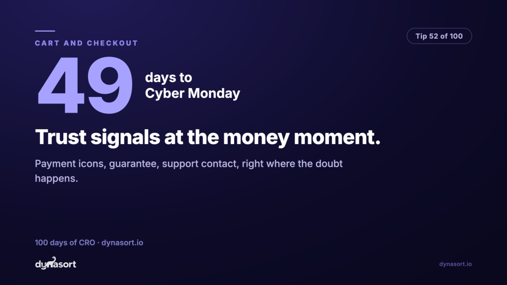
Each signal earns its place by answering a specific doubt. Payment icons and the padlock answer “is my card safe”. A concrete guarantee (“60-day returns, free and easy”) answers “what if it’s wrong”, and specific beats vague here by a mile; “satisfaction guaranteed” answers nothing. A visible support contact answers “is anyone home”, and it is the most underrated of the three, because a store that shows a real way to reach a human reads as a store that expects to be reachable.
What does not earn a slot: a wall of twelve badges from certificate vendors nobody recognizes. Unfamiliar seals do not add trust, they add clutter, and clutter next to the checkout button is exactly where you can least afford it. Three signals, recognizable and specific, beat twelve every time. And never let trust widgets crowd the button itself: the cart’s hierarchy is checkout first, reassurance in its shadow.
Ten-minute audit: open your cart on your phone, put your thumb on the checkout button, and ask the three doubts out loud. Wrong-purchase, reachable-human, safe-payment. If the answer to any of them is not on screen, that is your fix this week, and it is a copy-and-placement job, not a development project.