This week I was in Toronto for DotDev, Shopify’s developer conference. The talks were good. The hallway was better. And the one of the best conversations I had in that hallway was with three guys from a small Dutch studio called Craftshift: Farid Movsumov, Ozkan, and Umid.
I already knew Farid from X and previous conferences. He has one of the sharpest takes on all things Shopify, and if you build or sell on the platform you should be following him. But spending real time with the team taught me a lot about running a Shopify app company: how they decide what gets built, how they run CS, why their apps stay small and fast. I went in liking their product. I came home impressed by their process.
TL/DR: When merchants ask me about variant images or combined listings, and running a merchandising app means they ask a lot, I send them to Craftshift. Here’s the long version of why.
Who is Craftshift?
Craftshift is a five-app studio in Zaandam, just north of Amsterdam. Farid founded it. He grew up in Azerbaijan, studied computer engineering in Turkey, and has been building for Shopify long enough that his opinions come with scar tissue. The catalog is deliberately small, and every app in it carries Shopify’s Built for Shopify badge. That badge is Shopify’s own bar for speed, design, and clean integration. Clearing it five times out of five is a choice, not a coincidence. I can attest to how difficult one, let alone 5, are to attain.
The numbers hold up too: over 10,000 active installs, more than 500 five-star reviews, and a customer list that includes Yamaha, JOSEPH, BaubleBar, and Chronicle Books. Their operating philosophy fits on a sticky note. No bloat. No feature-gating. No surcharge for being on Shopify Plus. And when you open a support chat, the person typing back wrote the code you’re asking about. Farid even published the playbook behind Rubik’s first hundred five-star reviews, which landed in eight months. Most developers guard that kind of thing. He gave it away.
Two of their apps overlap with the world I live in, product presentation, so those are the two I’ll dig into.
Rubik Variant Images & Swatch
Start with a problem every merchant with colorways knows. Shopify’s default gallery shows every image on a product, always. Your shopper picks the forest green hat and still scrolls past sand, rust, and charcoal. At best it’s clutter. At worst they order the wrong color, and now you’re paying return shipping on a $30 hat.
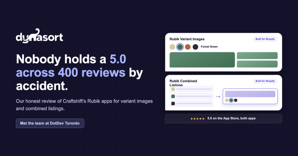
Rubik Variant Images & Swatch fixes it the way you’d want it fixed. Photos belong to variants, and the gallery only shows what’s selected. Pick green, see green. The part that saves you an afternoon is the AI assignment: it reads your photos and maps them to the right variants on its own, which on a 200-SKU catalog is the difference between a project and a coffee break. You also get proper swatches, color or image based, support for multiple option types at once, video and 3D models, and clean behavior across 350-plus themes with no page-speed tax.
It holds a 5.0 rating across 400 reviews. Scroll through them and one word keeps surfacing: support. That tracks with my read of the team. Pricing starts free for one product, then $25, $50, and $75 a month as catalog size and AI usage grow, with a third off if you pay annually.
One honest caveat: on a very large catalog you’ll still want to spot-check the AI’s first pass. It gets you ninety percent of the way in minutes, and the last ten percent is yours. That’s the right trade.
View Rubik Variant Images on the App Store
Rubik Combined Listings & Swatch
This one is my favorite of the two, because it solves a problem most merchants assume they’re stuck with. Sometimes your variants aren’t variants. Each colorway is its own product, either because that’s how the catalog was imported or because each one earns its own SEO page. Shopify’s variant model won’t merge them. Shopify’s native Combined Listings feature handles the data relationship, but the storefront experience is left as an exercise for the reader.
Rubik Combined Listings & Swatch does the storefront half. It links the sibling products and presents them as one listing with a swatch picker, on the product page and on the collection card. A shopper flips from sand to forest without ever noticing they crossed a product boundary. Every product keeps its own URL and its own search equity. You group in bulk by title pattern, tag, or metafield instead of clicking through products one at a time. Sold-out siblings can be crossed out, hidden, or pushed to the back. It handles multiple languages and currencies. And it ships with an MCP server so developers can drive it from their own tools, which tells you a lot about how this team thinks about the next few years.
It’s the newer of the two, so the sample is smaller: a 5.0 across 57 reviews, with merchants saying some version of “my product pages are finally clean.” Free for five product groups, then $10, $30, and $50 a month.
View Rubik Combined Listings on the App Store
The other half of a good collection page
Here’s why I pay attention to these two apps in particular. Dynasort’s entire job is order: putting the products most likely to sell at the top of your collections, search results, and recommendations. But a collection grid has two halves. There’s the order of the cards, and there’s what a shopper can do once they’re looking at one.
I can put the right hat in position one. If its gallery is a jumble, or its colorways are scattered across three product pages, the click still leaks. Rubik closes that gap: right photos for the selected variant, a swatch the shopper can act on, sibling products behaving like one listing. Dynasort works on the order. Rubik works on the click. Run both and the same grid sells more, without touching theme code and without slowing the page.
Questions I’d ask before installing
What does Rubik Variant Images & Swatch actually do?
It shows only the images that belong to the variant a shopper selects, instead of Shopify’s default of showing every image at once. It adds color and image swatches, and its AI auto-assigns photos to the right variants. Built for Shopify, works across 350-plus themes, no page-speed cost. See the listing.
Will these apps slow down my store?
No. Both carry Shopify’s Built for Shopify badge, which sets a hard bar for storefront performance. They render lightweight code instead of bloating your theme, so there’s no meaningful page-speed hit.
How is Rubik Combined Listings different from Shopify’s native Combined Listings?
Shopify’s native feature handles the underlying data relationship between products. Rubik builds the storefront experience on top: swatch pickers on product pages and collection cards, real-time sync, bulk grouping by title, tag, or metafield, and smart out-of-stock handling. Each product keeps its own URL and SEO. See the listing.
Do the Rubik apps work alongside Dynasort?
Yes, and they’re complementary rather than competing. Dynasort decides the order of your collections, search, and recommendations. Rubik makes each product card shoppable with the right images and swatches. No conflict; together they cover both the order and the click.
Who makes the Rubik apps?
Craftshift, a studio in Zaandam, Netherlands, founded by Farid Movsumov and run with a small team including Ozkan and Umid. More than 10,000 installs and over 500 five-star reviews across their five apps, all Built for Shopify. Follow Farid at @faridmovsumov or visit craftshift.com.
How much do the Rubik apps cost?
Rubik Variant Images: free for one product, then $25, $50, and $75 a month as catalog and AI usage grow. Rubik Combined Listings: free for five product groups, then $10, $30, and $50 a month. Both discount annual billing. Check the listings for current details.
If either app sounds like your problem, install it and look at your own catalog with it switched on. That beats any review, including this one. And if Farid, Ozkan, or Umid shows up in your support chat, tell them Wade sent you. Good people building good software, and the app store never has enough of either.