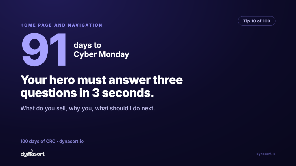
Your home page hero has about three seconds to answer three questions: what do you sell, why should I buy it from you, and what should I do next. A first-time visitor who cannot answer all three from your opening screen does not scroll down to investigate. They leave, and they take your ad spend with them.
The test is brutal and free. Show your home page to someone who has never seen your store for three seconds, then hide it and ask the three questions. Most merchants who try this get a nasty surprise, because the hero says something like “Elevate Your Everyday.” Elevate what? With what? Candles? Software? Protein powder? Your brand team knows. The stranger with the credit card does not.
A hero that passes the 3-second test
Every element earns its place by answering one of the three questions.
Run this on your phone viewport too: on mobile, the three answers have even less room to hide.
The common failure modes
- Poetry where the category should be. Vague mood headlines are a luxury for brands with national ad budgets. Everyone else leads with what the thing is. Clever comes second, clear comes first.
- A carousel of five heroes. Rotating banners answer the three questions five different ways, which is the same as not answering them. Pick your best message and give it the whole stage.
- Three competing CTAs. “Shop Men,” “Our Story,” “Join the Club” in equal weight is a shrug. One primary action, visually dominant. The rest can live in the nav.
- Answers hiding below the fold. If “why you” only appears in a features section two scrolls down, it does not exist for the visitor who never scrolls.
Returning customers do not need the hero; they head straight for new arrivals or search. The hero exists for the first-timer arriving cold from an ad or a shared link, exactly the traffic that spikes in Q4. Fix it now, run the three-second test on a stranger, and your most expensive clicks stop bouncing off a riddle.