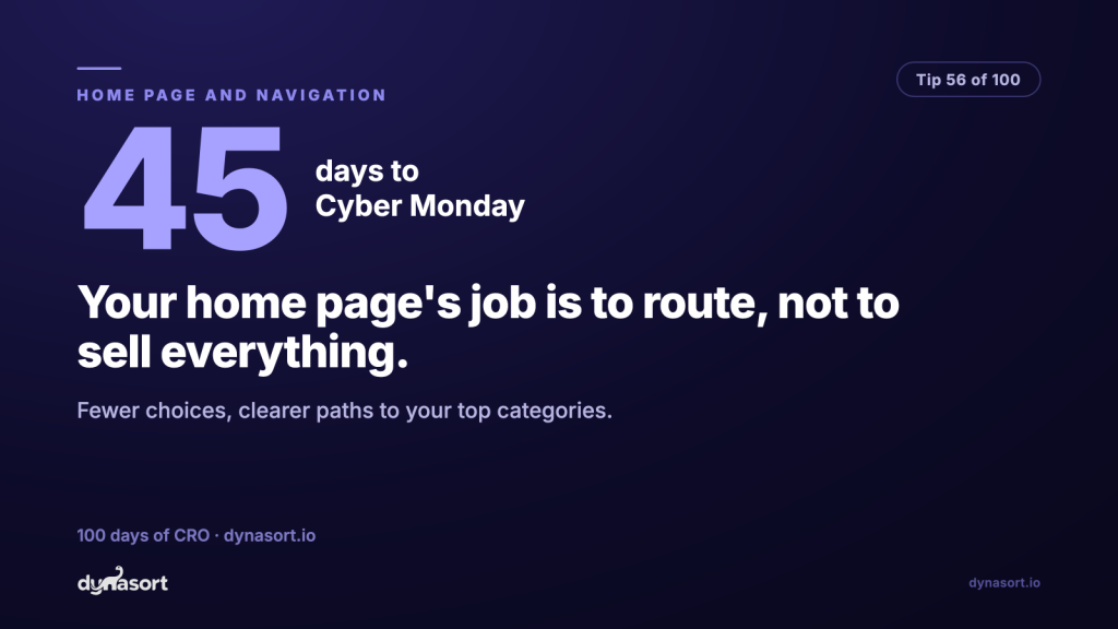
Your home page’s job is to route, not to sell everything. Nobody adds to cart from the home page; they leave it in the right direction or they leave your site. Yet most Shopify home pages are built like a department store where every department head got to bolt their own banner to the front door: a hero, a bestseller carousel, a new arrivals carousel, three promo tiles, a founder story, a lookbook, an Instagram feed. Sixteen screens of scroll, assembled by committee, converting nobody.
Here is the reframe: the home page is a train station, not a showroom. Its success metric is not sales, it is how fast each visitor gets onto the right platform. A gift shopper needs “gifts under $50”. A regular needs “new this week”. A first-timer needs “start with our bestsellers”. Every extra section between a visitor and their platform is not merchandising, it is delay, and mobile shoppers experience delay as a reason to leave.
The ruthless version
- Pick your three or four money paths. Look at your data: which collections actually produce revenue? Those are the platforms. Everything on the home page either routes to one of them or fights for its life.
- One screen, one decision. The first viewport keeps its job from tip 10: what you sell, why you, where to go. The very next section is the category router, big tappable tiles to your money paths, above every carousel and story block.
- Kill the tie-breakers. Two carousels of overlapping products force the visitor to arbitrate between your widgets. If bestsellers is the strongest path, it gets the slot; new arrivals lives one tap away, not one scroll away.
- Let the routed pages do the selling. Persuasion lives on collections and PDPs, where tips 2 through 54 have been sharpening it. The home page’s only pitch is “you are in the right place, go this way”.
The ten-minute audit: open your home page on your phone and count the taps and scrolls between landing and your single highest-revenue collection. If the answer is more than one scroll and one tap, your best sales path is buried under sections that exist because someone liked them in a meeting. This matters double before BFCM, when your traffic skews toward strangers in a hurry. Strangers do not browse; they follow signs. Build better signs.