Variant selection UX, the swatches and dropdowns on your Shopify product page, is where a decided buyer either finishes the job or quietly gives up. This shopper already wants the product. They are past your hero image, past your reviews, hand on the wallet. The only thing left between them and the cart is picking a size and a color. It is astonishing how many stores make that final step feel like filling in a tax form.
Swatches beat dropdowns, almost always
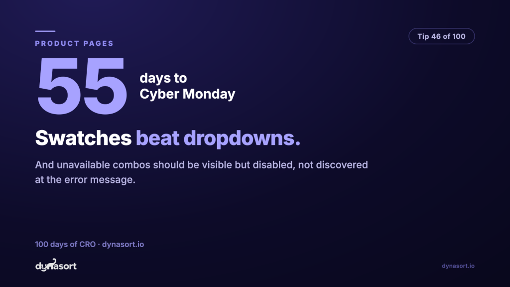
A dropdown hides your options behind a click. A swatch row shows them all at once: every size visible, every color visible as an actual color, tap targets big enough for thumbs. The shopper scans the whole decision in one glance instead of opening a menu, reading a list, closing it, and opening the next one. For the two variant types that dominate ecommerce, size and color, the dropdown has exactly one defense: it is the theme default. That is not a reason, that is an accident you have been shipping.
The honest exception: options with many values that read as text, like 40 ring sizes or a list of engraving fonts. A 40-button swatch wall is worse than a dropdown. The rule underneath both cases is the same: minimize the taps and the reading needed to see what your choices are.
The error message is not an inventory system
Here is the crime that actually costs money. A shopper picks Blue, picks Large, taps add to cart, and only then learns that Blue in Large does not exist or sold out. They did everything right and got punished for it. Some will retrace and try Navy. Most will read it as “they don’t have my size” and leave, and they will not be wrong to.
Unavailable combinations should be visible but disabled: greyed out, crossed through, still on the page. Visible, because hiding the option makes shoppers think you never made it in their size at all, and because a greyed-out Large is a natural place to hang a back-in-stock signup. Disabled, because letting someone select a dead end and discover it at the error message is the interaction design equivalent of a shrug. Good themes update swatch availability live as each option is picked. If yours does not, this is one of the highest-value small fixes you can hand a developer before Q4.
The last step, two ways
Same product, same missing variant. One page admits it up front, one lets the shopper find out the hard way.
Dropdowns + error
Options hidden behind clicks, and the bad news arrives after the shopper commits.
Swatches, live availability
Color
Size
Every option visible at a glance. Blue Large is greyed out before anyone wastes a tap on it.
The disabled swatch is also free demand data: shoppers hovering over a dead Large are telling you what to restock.
The five-minute audit
- Open your bestselling multi-variant product on your phone. Are all sizes and colors visible without opening a menu?
- Deliberately pick a sold-out combination. Were you warned before the add-to-cart button, or after?
- Check the tap targets: can you hit each swatch with a thumb on the first try?
- Sold-out sizes: is there a back-in-stock signup, or just a dead grey square?
Fail any of those and you have found this week’s fix. Buyers this close to the finish line are the cheapest conversions on your store; stop tripping them at the tape.